Bittersweet
Branding & Visual identity
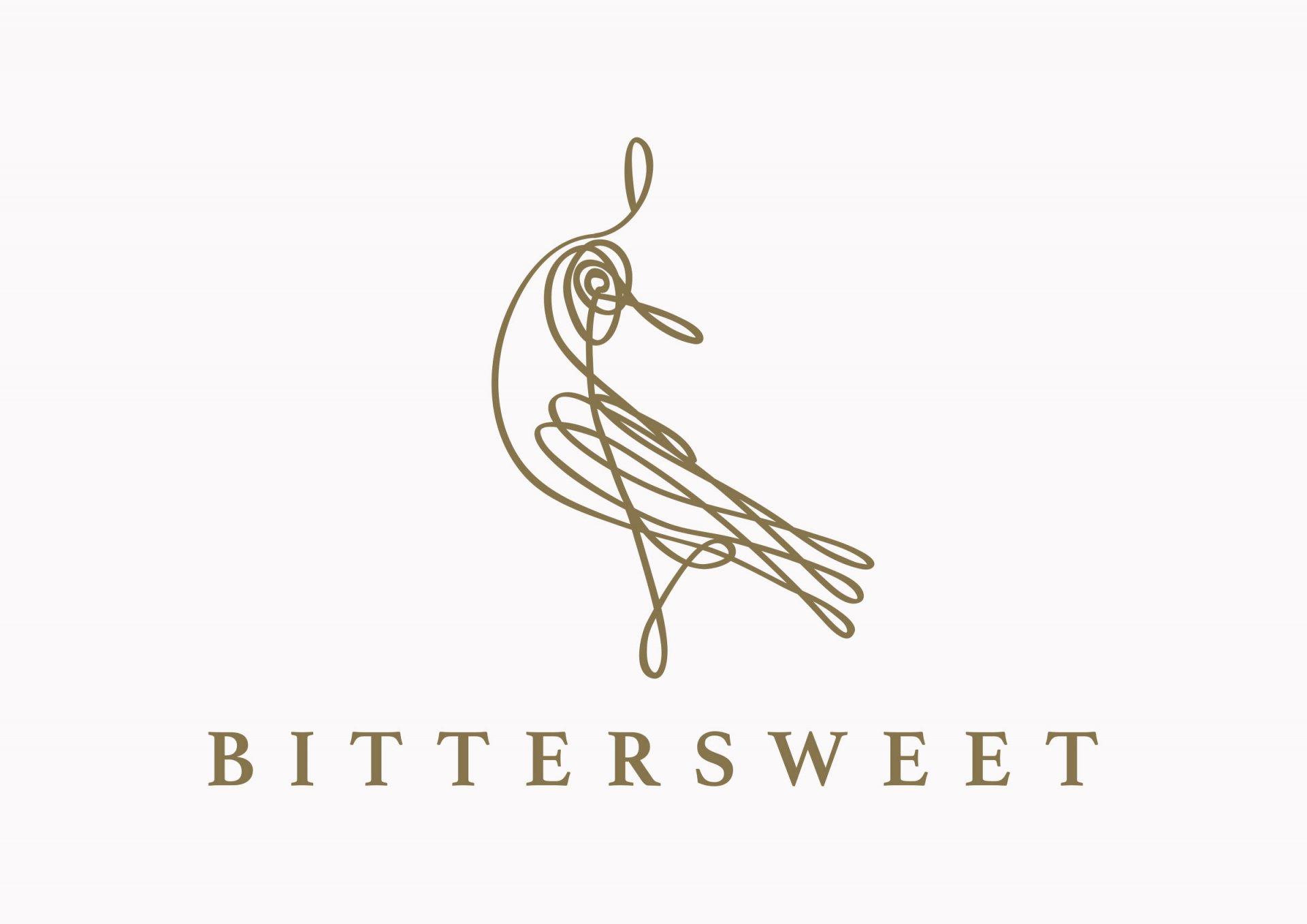
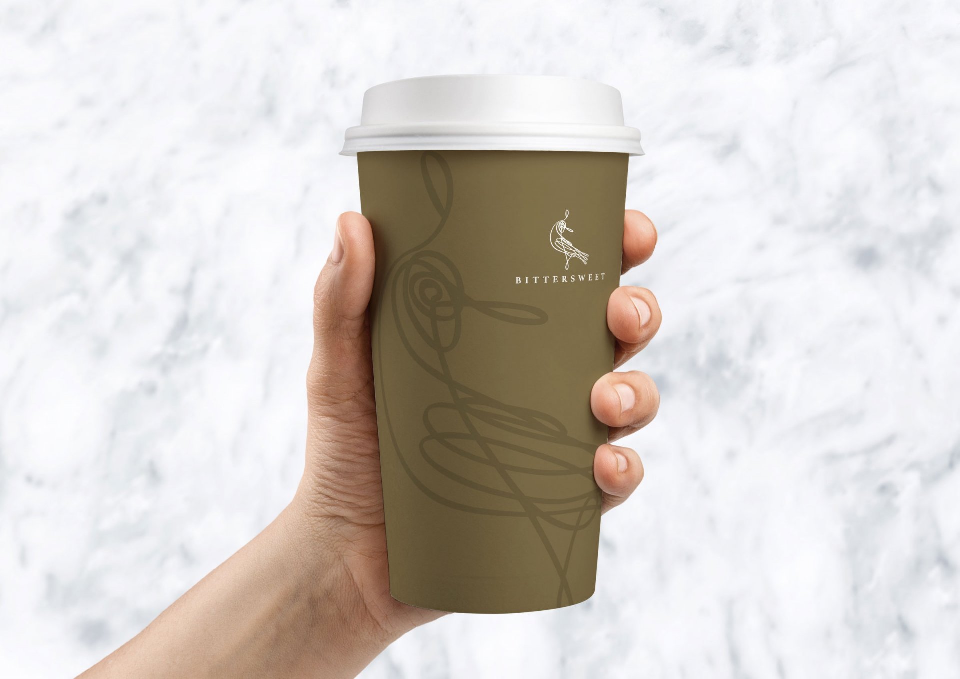
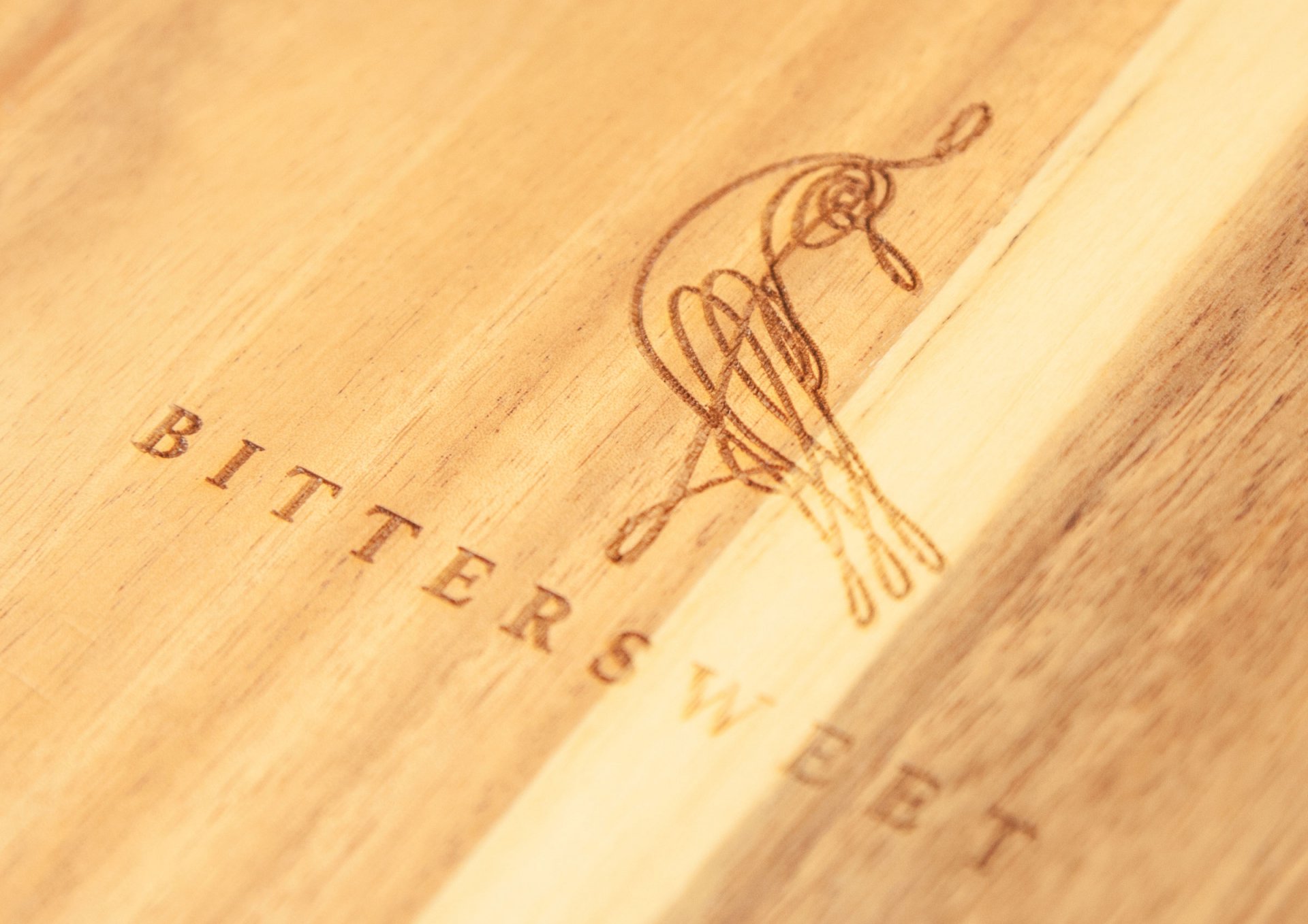
Bitter Sweet is a bright, sophisticated café with a familiar sense of homely warmth and British look. The logo is an abstractive phoenix figure. Phoenix is a unique bird that lived for centuries and it has the meaning of renewal, immortality and transformation. The phoenix embodies the personality and will of the owner of Bitter Sweet – “we pride ourselves on quality of the food and comfortable environment we serve our loyal customers, and that’s the reason why they keep coming back.”
WHAT WE DID
Brand Strategy, Brand Proposition, Naming, Brand Identity, Design & Creative, Space Concept